After finding out that NME don't rate using the star method, I have changed the magazine from 'NME' to 'MOJO'. This is to make my advert more credible and professional and give Rosa-Leigh a more esteemed name.
Showing posts with label Magazine Advert. Show all posts
Thursday, 23 January 2014
Wednesday, 22 January 2014
Saturday, 9 November 2013
Magazine Advert Feedback
The other feedback was that I haven't added what its available on such as CD, Vinyl or Download so i needed to add them to the poster so that the target market know where they can buy Rosa Leigh's music from.
Wednesday, 6 November 2013
Further changes to Magazine Advert
It was suggested to me to adhere to the rule of thirds; something which I had previously thought about but not made clear within my work. This screen grab shows the page divided into 15 large squares from the top of the page to the bottom, therefore each third is 5 squares high. I have ensured 'Rosa-Leigh, A Beautiful Life' remains within the top third, the spiral and 'new album in the middle' and the remainder within the last third.
I feel it separates the page up nicely, giving everything it's own space, meaning the page is not crowded. The spaces are roughly equal and everything centred, therefore I feel that adhering to the rule of thirds has improved the layout and overall image of my magazine advert, even if it is only a slight change in movement.
Monday, 4 November 2013
Changes to Digipak and Advert
After evaluating the feedback from Mr Ford, I made appropriate changes to my designs. I have amended only the front and back covers to ensure that they look professional and neat. I have changed the image on the front cover and have removed the volume button, as Mr Ford advised this. I have also made the font smaller on the back cover, so it's not as close to the sides of the digipak. I have done this so the layout is more effective and the words can be easily read without fear of bending or being cut off in production. 

I also removed the volume sign from my magazine advert, as Mr Ford advised I should. I definitely prefer the new design, as looking back on my old advert I can see that the volume button does not fit in and is too large for the page. The largness of the image is down to the image being stretched and it therefore looked distorted. Instead I have used the swirl featured on the inside of the album digipak, and I think this looks much better. I have included two star ratings instead of the one, and I have altered the sixing of the text to make them easier to read.
Friday, 25 October 2013
Feedback for Digipak and Advert
Digipak:
I was given 9/10 for the design and draft of my digipak by Mr Ford, and the feedback he gave me was to change the volume button as it was too distinctive as being Apple's. This links to verbal feedback he also gave me a few days before the deadline, in which he said I could ether remove it or attempt to create my own. Verbally, he also mentioned changing the size of the text on the back cover, so the first and last track names weren't too close to the edges of the panel.
To accomdate this feedback I have changed the front cover so that the volume button is no longer included. I understand how it was recognisible as Apple's, and therefore not suitable to use on my final digipak and have attempted to create a professional album cover using only the background photo, text and the blue sticker effect. To create a plain background instead of the volume button image, I have used the same photo on the front as is included on the back. This means the back and front cover are essentially the same, just including different styles of text.
Magazine Advert:
I also got 9/10 on the magazine advert; just like the digipak , Mr Ford felt the volume button was the problem. However, after looking at my advert again, I also felt that the volume button was too large and distorted due to the blurred effect created by stretching the image. When developing ideas for changing the volume button on my magazine advert, I sought advice from George as we both knew eachothers ideas and felt we could help one another. He suggested that I include more star ratings, to not only break the magazine advert up a little and create more room, but to also give Rosa-Leigh more credibility and make her an even more esteemed artist.
When deciding on how the change my magazine advert I knew I had to remove the volume button, therefore decided also to use the image above on the advert, as a background. I then knew I needed to change the layout to compensate for the gained space within the layout. Because the image ties the digipak and advert together, without the volume button I also decided to play around with an added link; the swirl featured on the inside of the digipak.
Wednesday, 16 October 2013
Monday, 7 October 2013
Magazine Adverts 3

Plain background, colour stands out, album artwork has been used, various platforms have been mentioned, 'out now', website plus other information such as tour dates have been included, band logo as well as record label logo
Mentions the availability of the formats in music, bold title and band name, clear release date, 'new' album makes it sound exciting, website has been included
Hand-drawn effect, clear release date, band and record label logo's, album artwork used in contrast to black background, consistent font, bold, stands out
Extended album cover to fit A4, bright and colourful, eye-catching, release date, songs it includes, website, record label logos

Extended album cover, release date, clear band title and album name, interesting as there seems to be a hand pulling back the page - yet it is part of the advertisement, makes it different and unusual, includes mentioned songs, record label logo and website are included

Album cover blends into white background, clear title, exciting and eye-catching graphics, record label logo, 'out now', includes mentioned singles, bonus track also, makes the audience feel like they are getting exclusive content and more from their favourite band, various platforms also mentioned

Dark, a lot of writing at first glance, image that stands out taken from album cover, black background contrasts with the writing, star rating and quotes from various publications, record label logo, website

Album cover added onto orange background, clear album and band name (self-titled album) eye-catching graphics, clear release date, QR code also supplied, featured songs, website, record label logo
Magazine Adverts 2

Simplistic, album image has been used, bold text that contrasts with the background, no other information included
Image of the artist, bold name of artist, image of the actual CD, star rating and comment from a music magazine, record label logo
Extended image of the album cover to fit A4, recommended store to buy CD at, bold band name and album title, release date, record label logo, website also included
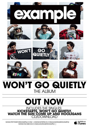
iTunes is where the album is available, websites are provided for fans, bold title and name of album as well as the album image against a white background, includes famous songs, 'out now' in its various platforms
Extended image of the album that fits A4, record label logo, bold title and band name, release date, website, no further information, simplistic
Album cover in the centre of the page, large bold and unusual title, 'in stores', release date, further information is given however the small font means I cannot read it

Album cover from 'Kiss of Life' has been used, bold name however the album name isn't given, prize nominated, quote from a newspaper, 'out now'
Magazine Adverts
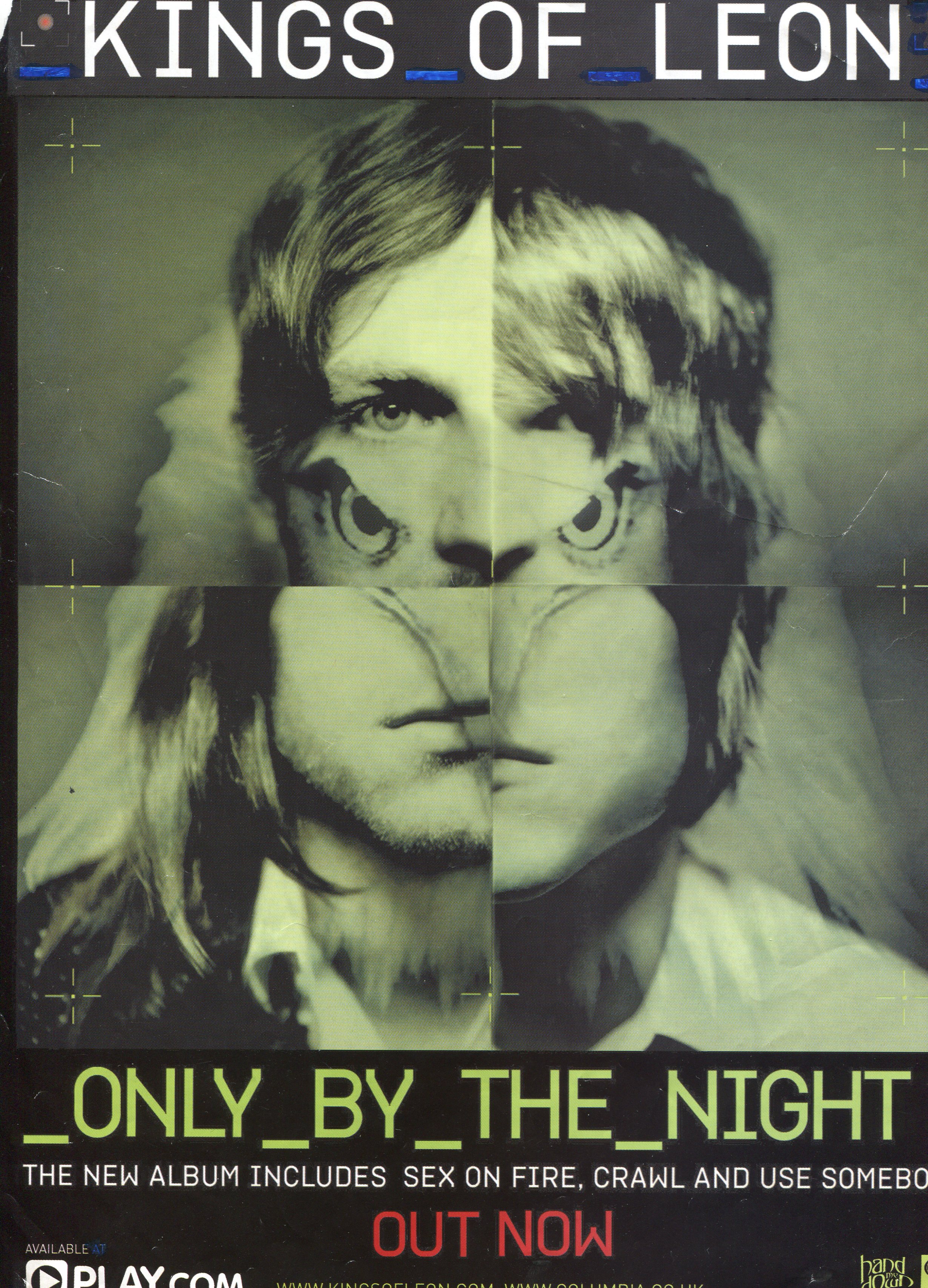
When creating my magazine advert I need to ensure there are clear links between that and my digipak. These examples have used the artist or album artwork to promote the CD within the magazine advert, and this is something similar to what I wish to achieve.
Album cover has been used, title clearly shown, consistent font, lets viewer know where to buy it from, record label logo, simple, dark background, bold text
Album cover has been used, release date provided, includes the names of well known singles, record label, website address, images of the band, bold title
Album artwork has been used, bold release date, ties in with colour scheme, bright colours, eye-catching, platforms are discussed, website is provided, record label logo, addresses shops which you can buy the music from

Bold title and band name, image of the band that features on the album cover, blurs into background at the edges, a lot more writing in comparison to the other adverts in this post, subtle release date - it's not as bold as the title, record label logo, website

Album artwork, blends into black background, bold album title and band name, emphasises it's their new album, featured singles, record label logo, website is mentioned

Extended album cover image, fits the a4 page, features band, star rating, bold title and band name, release date, record label logo, featured songs, various platforms of music
Album artwork blends into dark background, bold title and band name, release date, label logo, simplistic but bold

Various fonts used, star ratings, busy, lots going on, lots of writing in comparison to others such as the one above, recommends which store to buy from, record label logo, included tracks, available platforms

Simple, features album cover against black background, record label logo, website included, bold title and artist name, same colour scheme used for text as well as the album cover
Subscribe to:
Posts (Atom)