Monday 30 September 2013

Digipak Artwork 3


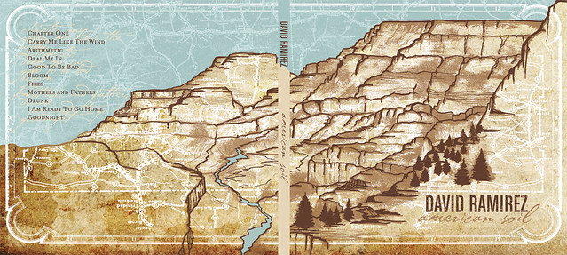
4 panels, shows front and back, font can be read clearly, image stretches over the two panels shown, tracklist seen on back, no barcode? spine adheres to the colour scheme, not the imagery 

4 panels, image continues over these two panels and onto the CD, vintage effect, blue white and red colour scheme 

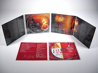
6 panels, purple is the main colour, text stands out, yellow on purple etc, tracklist on the back, information on the inside panels also, CD has the same imagery on it as the panel behind it 

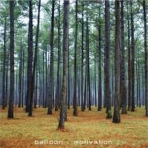
Simple, blue and green colour scheme, white font stands out from the background, 4 panels, tracklist contains times as well as song names, spine has the same font as the title 

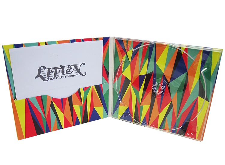
4 panels, same pattern and colour scheme, CD slot and pouch to put a booklet in, abstract shapes, eye catching, bold colours 


The same junk, odd bits and bobs theme has been used throughout, random letters spell out the album title, the inside panel contains the tracklist, handwriting font, barcode on the back, interesting to look at because of all the different components

Digipak Artwork 2

4 panels, cartoon style, drawn on the computer, bright bold colours, bold title and font, easy to read

8 panels, 2 CD's, blurred images, depicts scenes of everyday life, no visible link between the images, subtle colours
Natural scenery, handwriting effect, lyrics, brown and copper/orange/yellow, earth colours, constant theme 

Black and white contrast (added purple) chalk, handwritten effect, minimal


6 panels, constant theme of sketchy handwritten arrows and lyrics, purple sea, natural scenery, purple is the opposite end of the spectrum to yellow, they compliment each other, image goes over two panels 


6 panels, exotic, image stretches over three panels, panoramic, bold title, white contrasts with the earth tones within the plants 


6 panels, all of the same image, no clear text, gives an alternative rock vibe, 


Symmetrical digipak, pink purple and white, front cover isn't clear however the theme remains constant throughout the digipak, really interesting design, unsure how the back cover is read as there are two sides and upside down text

Digipak Artwork

4 panels, interesting sleeve to keep the CD in - not a standard clip in disc slot, track listings

Natural scenery, female artist on cover and inside the sleeve, images transfer across several panels, all compliments each other, constant theme, no disjuncture, 6 panels 

Natural scenery, 6 panels, slot for booklet or second CD, image behind CD slot also 

4 panels, constant colour scheme, subtle colours and text, not a lot of writing

2 discs, 6 panels, simple, blue and green (hint of red) colour scheme, white font stands out on blue, not particularly exciting or interesting  

6 panels, constant theme and blue colour scheme, created digitally, only slight parts done with photography, CD in the middle panel, often they fold into each other

4 panel, bold font, barcode and copyright easily visible, too negative to work with my ideas, yet if it was in a green or autumnal season it would depict the look I hope to achieve

6 panels, nature, cartoon style, digitally created, tracklist on the back cover, handwritten font 

Simple, eggshell coloured background, handwritten tracklist, 3 Cd's 

6 panels, no clear colour scheme as all panels feature a variety of tones and strange images and symbols, too crowded, text has been used but doesn't look bold enough to read 

8 panels, lyrics, tracklist, black and orange colour scheme, text can be easily read, however it's small 
4 panels, red cheme, white font, bold and can be read

Album Artwork 3

Natural scenery, bold artists name, clear detailed High Res image

Natural, added light effects using the colourful rainbow, small title of initials of the artists name

Natural scenery, super imposes images creates a blurred effect, the font choice isn't the style I want for my album cover, however the contrast between the orange and the blue tones is something I would want to experiment with
Plain white cover, image in the centre, typewriter style font

Blurred image, small titles in the middle, takes nothing away from the story behind the image, interesting to look at 

Unusual subject of album cover, the beast and the children contrast, creates an eerie atmosphere, text is bold, white, stands out 

Interesting font and how the 'Tired Pony' is presented, natural scenery, subtle colour palette 

Super imposed image of nature and girl, interesting effect, bright colours, eye catching, I really like this album cover

Bleak and dark, moody, pale text also, blends in, too negative in contrast to the ideas I want to use, the line in between the text is interesting and a possible experiment 

Blurry image, focuses more on the waves in the foreground, text is very small but the black contrasts against the pale sky 

Very colourful background image that allows the text to stand out more, dusty filters and light leak filter look like they have been used, or they can be used to achieve this effect 

Album Artwork 2

Natural scenery, balloons, cloud in the sky - something I am thinking about including

Title is too subtle, text is not bold or interesting enough, good use of trees and natural scenery

Interesting font, simple shot, blue and white subtle shot, complimenting colours

Cloudy background with earthy colours, bold white font, more writing than usual on the cover, nice use of lines to frame the text

No text on the cover, something I might consider adhering to, interesting mise en scene, not made to look pretty like a lot of other albums

Simple album cover, natural scenery, looks like a green filter has been used, adds another perspective of light

Unusual cover because of the lack of text and a different style of image, not a photograph, looks like a hand painted or inked one

Bold text, someone other than the artist on the cover

Interesting layout of words, contrasting bright yellow, unusual choice

Vintage style photo, the border frames the image nicely, subtle handwriting font used in the corners, a handwriting font similar to ones I am thinking about using 

Painted effect, not a photograph, unusual yet could be the depiction of the band

Simple cover, mysterious photo as the object isn't easily identifiable, top left hand sticker to display band and album name 

I'm interested in usually framed images, as this circle contrasts with the black background, super imposed image as a waterfall has been placed in the middle of a city 

I like this cover because of the white text on a washed out photo, subtle, colours aren't in your face, smoke effect, can be achieved with a filter or screen 

Unusual pattern, marbled effect, white faded text blends in 

Close up of shells, natural objects, faded text, not too clear, not easily read 

Quirky photo, the different fonts create an alternative effect, fit into that genre, stands out from the darker purple background