Natural scenery, bold artists name, clear detailed High Res image

Natural, added light effects using the colourful rainbow, small title of initials of the artists name

Natural scenery, super imposes images creates a blurred effect, the font choice isn't the style I want for my album cover, however the contrast between the orange and the blue tones is something I would want to experiment with

Plain white cover, image in the centre, typewriter style font

Blurred image, small titles in the middle, takes nothing away from the story behind the image, interesting to look at

Unusual subject of album cover, the beast and the children contrast, creates an eerie atmosphere, text is bold, white, stands out
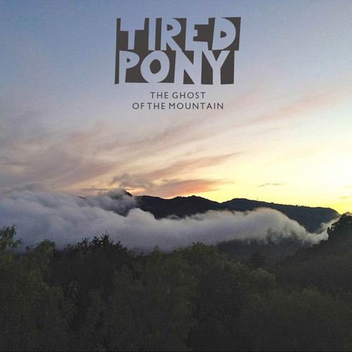
Interesting font and how the 'Tired Pony' is presented, natural scenery, subtle colour palette
Super imposed image of nature and girl, interesting effect, bright colours, eye catching, I really like this album cover

Bleak and dark, moody, pale text also, blends in, too negative in contrast to the ideas I want to use, the line in between the text is interesting and a possible experiment

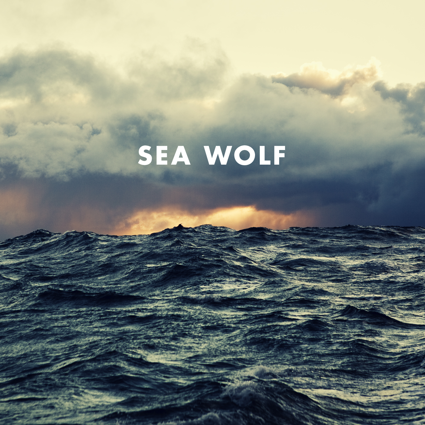
Blurry image, focuses more on the waves in the foreground, text is very small but the black contrasts against the pale sky

Very colourful background image that allows the text to stand out more, dusty filters and light leak filter look like they have been used, or they can be used to achieve this effect
No comments:
Post a Comment