I really like the simple and scenic album covers, people don't have to be included. The band doesn't have to be on the cover; same with the video. I don't like performance videos, and album covers with the band plastered all over it don't appeal to me, even though it promotes their image. Bands don't have to be styled or attractive, it's the music that counts, and I feel these album covers portray this.

Natural Scenery, the person on the front cover isn't the artist or band, links to autumn.
Title in top left corner, bold, sticker effect almost, subtle colours, interesting scene, difficult to tell what is happening, adds mystery

Small central image, simple mise en scene, bold image and title, oddly framed shot

No image, just pattern, simple, contrasting colours, small title at the top of the cover, slightly uninteresting and there's not much to look at

Similar to the vaccines cover, vintage photo, bold photo as contrasts to black background, olden style font, bold and easy to read

White text, something I'm interested in using, intersting alternative style

Alternative style, links to Young Alts and Indie Scensters

Many different images, collage effect, black and white, interesting, lots of things to look at

Bold title, natural scenery, odd camera angle as artist seems to be mif-flip or cartwheel, white, pure, very feminine

Image in the background with text overlayed, thin bone like text, ties in with image, small artist name hidden in the cover

People only slightly in the shot, natural, reminds audience of fun times, something our video hopes to achieve, album name and band clearly displayed at top

Even though it's not natural scenery, this simple shot looks good, and the main attraction is the band in the window (something i don't want to include but appreciate all the same)

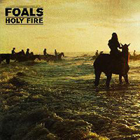
Water, natural, simple shot, bold title, eye catching

Bold white title, dark background

I really like this album cover as they've added digital effects in the form of triangles and circles, eye-catching, nice to look at, natural scenery

Interesting effects added to inital photo, subject isn't easily seen, subtle title, interesting colours

Odd cloud in shot, interesting mise en scene, natural scenery, people in the shot who aren't in the band, subtle watercolour images

Odd contrasting colours, no straight forward colour palette, added filters and dust/light leaks etc

Simple cover, natural sky, Simple title in top left corner

Natural shot overlayed with space shot, subtle title, super imposed iamge, light leak, different yet not incredibly interesting to look at

Simple image, natural water shot, interesting story behind it, subtle font in contrast to dark background
%20Kings%20of%20Leon%20-%20Come%20around%20sundown.jpg)
Nice colour palette, nice font that stands out on the darker orange yet is hidden by the lighter colours
Various colours have been used, blue, brown, natural shots, interesting yellow sun, adds another focal point to the cover
I really like this album cover as the natural scenery ties in with the writing, it doesn't stand out too much because it is similar to the specs of dust and plant within the shot

I like the idea of using balloons in either the video or the digipak, subtle colours
Bold text, contrasting pink and blue, shadows of people - they don't feature heavily

Typewriter effect is a nice font, vintage style photo, natural scene
No comments:
Post a Comment